top of page
Media Campaigns:
Series: Cobra Kai
The use of the repetition of the word "new" with the binary opposite of "same" could show the audience the upcoming threats that our "same" Daniel is going to face. This also gives a sense of familiarity as we as the audience will get given the chance to see the same Daniel LaRusso we saw in 1984. This would mainly attract Karate Kid fans as it gives a sense of nostalgia and mystery as to what the main protagonist has done throughout all those years away.
Also throughout the trailer, we get given dominant instructions in a bold Sans Serif which may attract people to watch it as they may feel as if it is an order for them to watch this TV show. This could also attract people to start Karate because the TV show portrays Karate to be the resolution of all problems so that everyone can find their inner peace. This is known as the secondary audience as those people who watch Cobra Kai would be watching it for the sake of learning the

Another way that Cobra Kai was successful was how it was delivered to its audience. This is evident as there is an Official Website Store Which sells Cobra Kai merchandise for those who really enjoy the series with the addition of a video game which is mildly advertised throughout the TV show.


Flex Tape Advertisement:
What is it's selling point?
Phil Swift (the presenter/salesperson) is a comedic person, resulting in many people watching the advert.
Learning Aim A:
Prezi Presentation Link:
https://prezi.com/view/szz01QbxMzBZQcRzQMVT/
Learning Aim B:

More people would prefer there to be a better song rather than it be frequent releases. I can apply this to my campaign as I will emphasise the quality of my artists' music.
Judging by the responses given, I can infer that many people would want my artist to be dressed casually with hoodies and tracksuits. this helps me as it gives me an understanding as to what my audience wants the appearance of my artist to be.


According to these answers given, my audience wants an artist which is aged 18-25. this is beneficial too as by having my artist aged 18-25, he can then relate to both the older generation and the younger generation.
Judging by these responses, I can infer that I should make my chosen genre a combination of hip-hop and Rap. This is beneficial as it gives me an understanding to what many people of my age range enjoy.


Based upon these responses, I can infer that the stereotypes of which are that the stereotypes of hip-hop are highly "over played". this is beneficial to me as it could give my artist an idea not to be too dramatic with the stereotypes.
Based on these responses, I can connote that I should base my artist from an inferior background for him to make his own name for himself. This is beneficial as it could give my artist more ways to communicate with his audience.


Judging by these responses, I can understand that the reason that these respondents would enjoy their favourite genre is because of how it is relatable to them. This is effective as it could also link to my previous point where he is given more ways to communicate with his audience.
Based on these results, I can infer that the majority of respondents would prefer the artist to be a male rather than a female. I will make my artist a male because I feel like I'd be able to understand my artist much more.

Conventions:
- My artist will be in casual attire, wearing a mixture of bright and dark clothing.

One thing I really like about Drakes attires that he has his outfit very simplistic but effective as he promotes the popular brand 'Jordan' by waring a white T-Shirt with the symbol showing to the audience.
I'll make my artists fashion sense similar to drakes as me personally, I want my artist just to feel comfortable with what he wears as his performance is going to be more crucial than what he wears.
- How is cohesion created through the different products?
I aim to use similar-looking fonts with similar promoting techniques and styles for all audiences to understand what they will be listening to.
As the respondents said that they would like my chosen artist to have a casual outfit/dress sense, I will aim to use both colour and costumes to fit chosen idea. This would mean that the colour would have to be mainly primary colours with a hint of either white or black, giving my artist more of a variety.
The costume would also consist of clothing which would mix with many audiences (such as wearing casual Jeans with a white/black T-shirt with a chain necklace.)
The fonts which I think will best suit the chosen album is something which is retro-style, linking to the older audience and some types of retro-style fonts are very bold, attracting all types of people to give the album more reviews.

Here are some font ideas which I have in mind:

Here are some costume ideas I have in mind:

How do artists from this genre usually promote themselves/ Are there any specific ways of communicating that these artists use in your genre?
Artists who make Hip-Hop/Rap content tend to use social media to promote their albums, and with the recent application called TikTok, this gives artists the chance to further promote their albums as they may do collaborations with other famous people with their song playing in the background, giving their audience the chance to ask more about what song is currently playing.
In contrast to using social media, I feel as if artists tend to avoid promoting their albums through Physical form (such as newspapers and billboard posters) as nowadays, their target audience would be comfortable using their phones more.

This is an advertisement of how the application TikTok works, with the ability of being able to plug in any song, giving both content creators and music writers the chance to collaborate and promote the artists songs from an album.
How may they get the audiences' attention?
In my opinion, I think that artists may tend to create songs which may be at a very high quality with a shorter running time of around 2mins to captivate their audience to repeat the song again and again.
Poster 1:
The reasoning as to why I feel that this concept of a Tour Poster is because this clearly shows who the artist is as the photo of the artist will be centralised.
Poster 2:
I feel as if this layout would be beneficial as it clearly shows the audience what the artist looks like as the artist image is centralised. Another thing which is centralised is the tour dates, this is beneficial as it makes the tour seem unmissable.
Album Cover:
Taken influence from The Weeknd's Dawn FM Album cover, I have implemented a square template with the photo of the artist being centralised and the album name and artists name being written underneath. The photo of the artist will be a close up where he is directly looking at the camera and there will be no light EXCEPT from one which will be above him.

This radio advert would be available on radio stations such as Capital XTRA and Kiss FM because those selected radio stations are more urban and appeal more to the younger generation.
TK1 Official Website:
I have chosen this specific layout of all of the pages as it clearly shows what the website has to offer. I plan to have the background as plain white as it would represent simplicity and minimalistic design.
My merchandise page will include some pieces of clothing which would give some sort of connection to the artist.
My (most recent album) page will include the songs which are included in the album.
My tour dates page will include the dates and locations in which the tour will take place.
My latest news page will include what is going on in the life of my artist. This'll be used to inform his audience as to how he is.
My description & background page will include a description of how my artist became who he is today and what sacrifices he had to take.
Some ideas for merchandise:
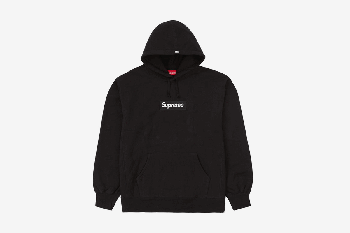
All I want for my merchandise is a simplistic design where it is a normal jumper with a square image of either a photo of the stars in the sky with the moon in the middle, or maybe a box logo of the album name "the 1 and only" in a sans serif edit.
Example of the box logo merchandise:
Learning Aim C, Artist Website:
https://tk1-official.wixsite.com/my-site-2
Learning Aim D, Review:

Overall, People think that I did a good job with the artist website. One thing I feel as if I could improve upon is to ask another question which would consist of my audience giving a reasoning as to why they thought what they thought.
By looking at my response, I feel as if everyone liked the album cover however just for next time, I should use a bit more colour for the cover.


By looking at my response, I feel as if everyone liked the colour scheme of the merchandise. this may be because of its simplistic outcome with only colours black and white being used.
By looking at my response, I feel as if most people thought that the prices for my merchandise was too expensive and should be lowered a little.


Personal Analysis:
One thing I personally liked with my artist website is how the different segments of my website are separated and labelled. This is beneficial for my website as it would make the website very straight forward and easy to access. However one thing I think I could improve on is finding a new background which does not blend into the writing as some people may find it difficult to read the text.

An example as to why I think people may find some trouble as to reading the text.
One thing I liked with my merchandise is the design where the stars are surrounding the moon and that same concept has been used for all the merchandise, showing the audience that I have consistency in my work. One thing I feel I could improve on is the colour scheme of the merchandise as, like the audience have said, there needs to be some colour to prevent the merchandise from becoming too bland. The merchandise also has a slogan labelled as "The 1 And Only" which has been placed on all merchandise to show that they all are from the same origin. This is effective as it would further let the audience understand that this is made by me.


With the Album Cover, I personally really like it because I took inspiration from The Weeknd's most recent Album Cover from the album "Dawn FM". On the other hand, I would understand the reasoning as to why someone might not like it due to the simplistic vibe it may give to the audience.


I feel as the font I have used was suitable for my website , however one way I could improve is I could make the text size bigger. this is because the writing isn't clear due to 2 reasons, colour of the text and size. therefore meaning I can either change the colour of the text or make the text larger. changing the text colour would be an issue as it wouldn't suit the simplistic view I intended to create.
My intention to use the radio advert is to further widen my target audience and I feel as I it has been used well because I (the Voice Over) spoke confidently, making my words project. this is effective as it shows the audience that a plan has been made, further meaning that this could become very successful and that I (the artist) know what to do to achieve success.
bottom of page